
An Interesting Silver Chart to Keep in Mind
The silver-to-sugar ratio signals that silver's consolidation phase is approaching its end.

As you may have noticed, I’m a big fan of unconventional economic and technical indicators, and I’m always excited to discover new ones. Along with creating my own indicators, I also learn from others and share them—with proper attribution, of course. Today, I want to bring your attention to the silver-to-sugar ratio, which is currently showing an intriguing chart pattern and breakout. This insight comes from a commodities investor I follow on X, known as ‘TheHappyHawaiian.’
Most investors are familiar with standard price charts for stocks, commodities, or cryptocurrencies, but far fewer are acquainted with ratio charts, which compare one asset to another to determine relative price performance. Ratio charts are helpful for assessing whether a commodity like silver is strengthening relative to other commodities, rather than just fiat currencies like the dollar or euro. For instance, if silver is rising faster than other commodities, it demonstrates high relative strength—an indication that further gains may be on the horizon.
As TheHappyHawaiian has highlighted over the past several months, the silver-to-sugar ratio has been forming a bull flag chart pattern since spring 2024. This pattern emerged as silver consolidated following a strong rally earlier in the year—a phase that frustrated many silver investors anticipating an even stronger performance. The good news is that the silver-to-sugar ratio is now breaking out of its bull flag, signaling a bullish outlook for silver.
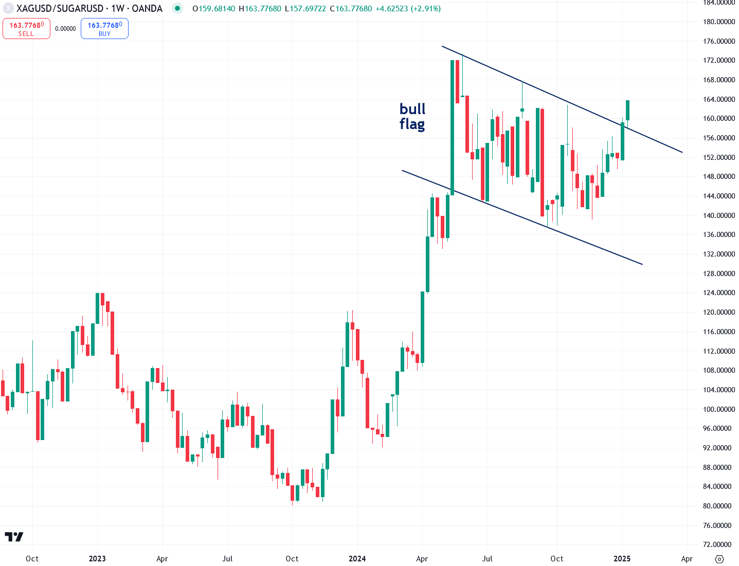
TheHappyHawaiian has also highlighted a long-term logarithmic chart of the silver-to-sugar ratio spanning two decades, revealing a clearly defined channel pattern. Historically, the ratio hitting the upper boundary of this channel has aligned with major peaks in silver prices, while reaching the lower boundary has marked significant lows. The encouraging news is that, based on the ratio’s current position within the channel, silver is far from a potential top—at least according to this historical relationship.

Tracking the silver-to-sugar ratio might seem unconventional at first, but there’s a method to the madness. Both silver and sugar are commodities sensitive to inflation, and share a notable correlation of 0.6 based on weekly data going back to 1971—a relationship clearly visible in the chart below. When the silver-to-sugar ratio rises, it indicates that silver is outperforming sugar, demonstrating high relative strength in silver.
For similar reasons, I also monitor the real price of silver, which is the price of silver adjusted for inflation using the U.S. Consumer Price Index (CPI). This approach helps determine whether silver’s rise is driven by its intrinsic strength or simply by inflation. When the real price of silver breaks into new territory, it signals robust momentum behind the move.
The real silver price chart reveals a breakout from a long-term triangle pattern in April 2024, spanning two decades—a strong indication that silver has entered a powerful new bull market. This breakout is a key reason I’ve remained consistently bullish on silver since the spring, despite its disappointing performance in recent months. I believe that once the real price of silver decisively breaks above the $32 to $34 resistance zone just overhead, the bull market will transition into a significantly stronger and more dynamic phase than anything witnessed over the past year. Patience and confidence are essential, and those who stay the course stand to be richly rewarded.

The long-term chart of the real price of silver, dating back to the 1960s, reveals that silver remains quite undervalued compared to its historic inflation-adjusted peaks—such as $195 per ounce in 1980 and $70 in 2011—while currently trading around just $30. This implies that silver holds tremendous upside potential. I believe it will eventually reach several hundred dollars per ounce during this bull market as our reckless Keynesian monetary experiment unravels in a catastrophic manner, triggering a dramatic shift of "paper" wealth into tangible assets like gold and silver.

Another way to assess whether silver is undervalued or overvalued is by comparing it to the U.S. M2 money supply—yes, another ratio. If silver's price rises faster than the money supply, it may indicate that the metal is overextended. Conversely, if silver lags behind money supply growth, it suggests undervaluation and the potential for future price increases. Over the past decade, silver has trailed M2 money supply growth, a promising sign for investors anticipating substantial gains ahead.

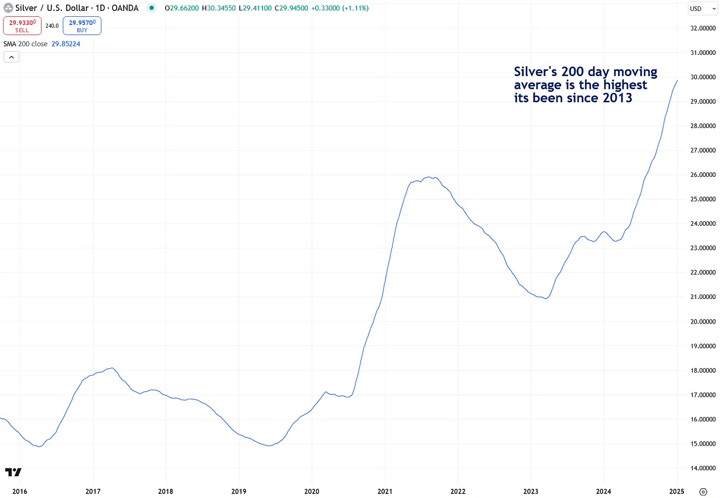
Finally, I know I shared this chart last week, but it’s worth highlighting again. While investor sentiment toward silver is currently quite negative, it’s important to take a step back and focus on the bigger picture, which remains very positive. The 200-day moving average of silver prices—a useful indicator that smooths out short-term volatility—is now at its highest level since 2013. Trends in motion tend to remain in motion, suggesting that this underlying strength is likely to carry into this year and beyond.
The emerging breakout in the silver-to-sugar ratio is just one of many indicators signaling a promising future for silver. Despite retail investor sentiment being deeply negative, this is actually an encouraging sign from a contrarian perspective, as such sentiment is typically at its worst at the start of major bull markets. As demonstrated, silver remains significantly undervalued by various metrics and holds immense potential as paper wealth shifts toward tangible assets. Astute investors are taking advantage of this rare window of extreme undervaluation to accumulate physical silver before the opportunity slips away for good.
A capitalistic country rigged by fixed prices and even interest rates, is a Socialistic controlled oligargy.
There are no markets....that are not rigged in the USA.
Comex is the brics best friend...Undercover agent..?
Excellent piece.
I have been using the Spot Silver/Sugar ratio for a couple of years now.
This is tandem with GSR and Spot Silver/SPX gives evidence of silvers strength (or not).
Once you have these three ratios showing the moment, the rest of the weight of evidence seems to fall into place.
However, remember that Gold tends to lead and that once Silver has played catch up, the window of life changing gains can shut closed rather rapidly!
Charlie.
Lowercosta.com