
Support & Resistance Zones Explained – Part 1
This powerful—yet deceptively simple—market analysis technique has accurately called some of the most important recent moves, including gold’s $1,500 surge over the past year.

In much of my content and analysis in this newsletter, I rely heavily on a technical approach known as support and resistance zones—a methodology I’ve used with great success to make a number of major market calls across precious metals, commodities, stocks, and cryptocurrencies (as I’ll demonstrate shortly). While the concept is relatively straightforward, I’ve come to realize that not everyone may be fully familiar with how I identify these zones or why they form.
That’s why, in this two-part series (with Part 2 coming in the next couple of days), I’m breaking it all down in detail—so all of my paid subscribers are on the same page and better equipped to understand both the markets and the reasoning behind my analysis.
To begin, I want to share my philosophy and approach to technical analysis. I favor a minimalist and streamlined style—by design. This stands in sharp contrast to the approach taken by many market analysts (and especially newer traders), who often overload their charts with a dizzying array of technical indicators. The result is cluttered and confusing, like the example I’ve shown below.
Even though the example below uses only four common and popular indicators, the chart still comes across as overwhelming and visually chaotic in my view: the Ichimoku Cloud layered directly over the price, volume plotted underneath, the MACD (Moving Average Convergence Divergence) momentum indicator, and the RSI (Relative Strength Index), which is used to gauge whether an asset is overbought, oversold, or in neutral territory.
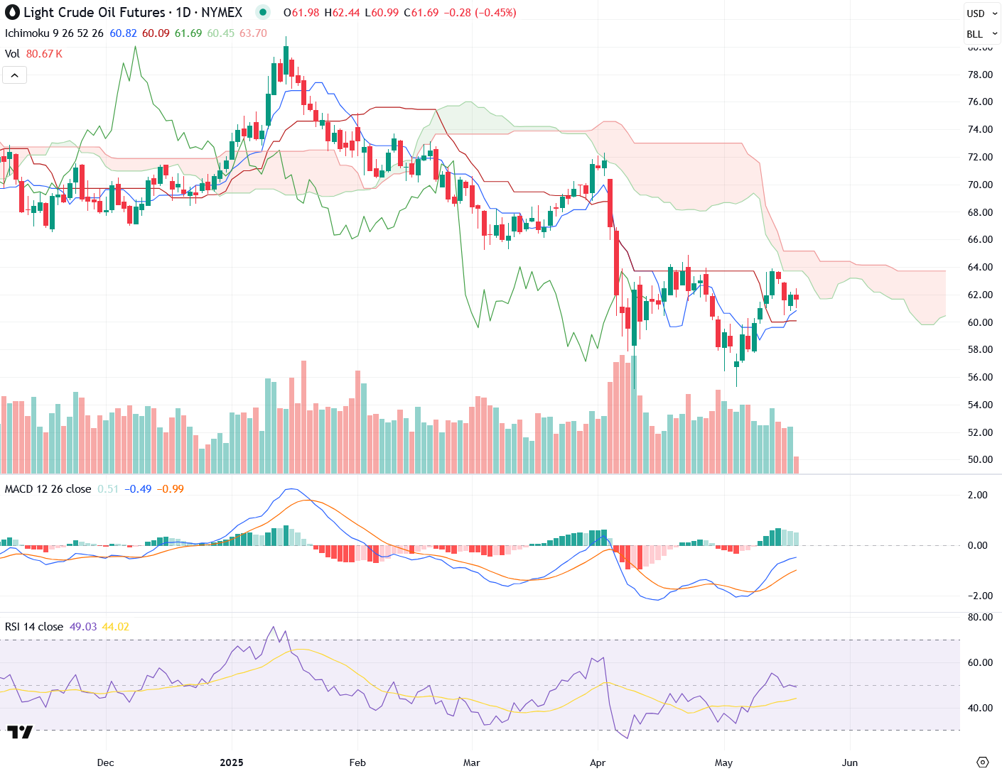
As I mentioned earlier, many new traders and analysts are drawn to exotic or cutting-edge indicators. But with experience, they eventually see the writing on the wall: most of these tools overlap significantly and, more importantly, are simply derivatives of price—making them delayed and lagging by nature. As traders mature and become more successful, they often start stripping away these layers, gradually simplifying their charts until they’re focused on the basics: price and volume.
That’s why the analysis I share in this newsletter is intentionally minimalistic—not out of laziness, lack of ability, or anti-intellectualism, but because I’ve found it to be the most efficient and powerful approach. If I come across a truly exceptional indicator, you can bet I’ll use it—and make sure my subscribers benefit from it. But more often than not, the key is cutting through the noise to clearly read what the market—or “the tape”—is actually saying. And this isn’t just theory: I’ll be showing you real examples where I made highly accurate calls using little more than price analysis alone.