


Why I'm Growing Even More Concerned About Stocks
There are concerning signs of technical breakdowns across the stock market, and Friday’s selloff has only intensified the situation.

In my last stock market update a week ago, I noted that the market had bounced as expected—but I also expressed skepticism about the strength of that rally. I pointed out that the rebound lacked conviction, came on weak volume, and was driven more by retail traders (“dumb money”) than institutional investors (“smart money”). Sure enough, those concerns came to a head on Friday, when the market sold off sharply, nearly erasing the previous week and a half of gains. In this update, I’ll break down where the U.S. stock market stands now—and explain why I’m growing increasingly concerned that even more downside may be ahead.
Friday began on a relatively quiet note—until the 8:30 AM release of the Personal Consumption Expenditures (PCE) report, which came in hotter than expected at an annualized rate of 2.8%. That reading reignited fears the market has been grappling with: the threat of stagflation—persistent inflation coupled with economic weakness—something I’ve been warning about recently.
Then, at 10 AM, the University of Michigan’s March consumer sentiment survey added fuel to the fire, revealing that sentiment had dropped to a 32-month low. Notably, more Americans now expect rising unemployment in the year ahead than at any point since the financial crisis. This one-two punch of discouraging data sent stocks sharply lower: the S&P 500 fell 2.0%, the Nasdaq 100 dropped 2.67%, and the Dow slid 1.76%—not surprising, given how flimsy the preceding bounce had been.
Stocks have sold off sharply in recent months amid a perfect storm of headwinds: inflation remains stubbornly high, uncertainty has surged following the Trump administration’s erratic tariff announcements and negotiations, and recession risks are rising—as reflected in a range of indicators, including prediction markets like Polymarket and Kalshi, which I’ve averaged and combined into a single chart:

There are also several inflation indicators showing that inflation is high and likely to keep rising including the 5-year inflation breakeven rate, as shown in the chart below. This rate, calculated as the difference between the yield on a nominal 5-year U.S. Treasury note and a 5-year Treasury Inflation-Protected Security (TIPS), reflects the market’s forecast for average annual inflation over the next five years.

Now let’s turn to the technicals, starting with the bellwether S&P 500. From December through February, the index carved out a clear triple-top pattern before breaking decisively below the key 5,800–6,000 support zone—a classic bearish signal. During the recent rebound, the S&P 500 retested that 5,800 level as overhead resistance but failed to break through, which played a major role in Friday’s sharp selloff.
As I pointed out in my last update, the rally was driven by light volume—a sign of weak conviction among buyers. At this point, the chart suggests the market is rolling over. With Friday’s decline confirming the breakdown, the technical outlook remains bearish, and the risk is biased to the downside.

One key scenario to keep in mind—common to all bear markets—is the transition from an uptrend to a downtrend. This shift becomes much easier to spot with the help of the 200-day moving average, which smooths out price action and reveals the market’s core direction. As the chart below illustrates, until recently, the 200-day moving average had been trending upward—a sign of strength and a confirmed uptrend, when trading with the trend (and “buying the dips”) makes sense.
But after the recent selloff, the 200-day moving average has started to decelerate—a classic early sign that the uptrend may be giving way to a downtrend. To be clear, it’s still relatively early, as the moving average is technically still rising. However, I created the hypothetical chart below to illustrate what to watch for if the market is indeed entering a bear phase. If the moving average eventually begins to slope downward, that would signal a confirmed downtrend—when the best approach shifts from “buy the dips” to “sell the rips.”
In addition to my concerns about a potential trend reversal, there's another critical development: the S&P 500 is now trading below its 200-day moving average—a key technical level that often serves as both support and resistance. And, as legendary hedge fund manager Paul Tudor Jones once said, “Nothing good happens below the 200-day moving average.” On Wednesday and Thursday, the index made an attempt to reclaim that level, and many investors were quick to celebrate. But that optimism was short-lived, as the market sold off sharply on Friday, decisively rejecting the move higher—a troubling signal.

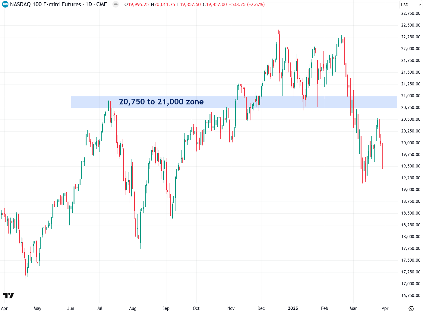
The tech-heavy Nasdaq 100 recently broke below the critical 20,750–21,000 zone I’ve been closely monitoring, confirming a significant technical breakdown. Like the S&P 500, the Nasdaq 100 attempted to retest this zone—now acting as resistance—but failed and subsequently sold off sharply on Friday, signaling continued weakness. At this point, there are no clear or meaningful support levels in sight, suggesting the path of least resistance remains to the downside—especially when you factor in the additional warning signs in the tech sector that I’ll highlight next.
A look at the Nasdaq 100’s weekly chart reveals a confirmed breakdown this past week below a key trendline that had been in place since early 2023. That’s a significant technical failure, marking the end of the uptrend from that period and the beginning of a potential downtrend. This has serious implications for the market’s most dominant names over the past couple of years—particularly Nvidia and the other “Magnificent 7” stocks, which I’ll highlight next. Given that tech has been the primary driver of the U.S. stock market’s gains in recent years, this kind of breakdown is a troubling omen for the broader market.

The Nasdaq 100—and the broader market—has been largely powered by the “Magnificent 7” stocks in recent years: Alphabet, Amazon, Apple, Meta, Microsoft, NVIDIA, and Tesla. A key proxy for their performance is the MAGS ETF, which tracks this elite group. Over the past month, however, MAGS has broken below both the $53 and $50 levels—clear signs of weakness.
It’s currently hovering just above a critical support at $46. If that level breaks (which I believe is likely), it will trigger another wave of selling in the Magnificent 7, the Nasdaq 100, and the broader market. Keep a close eye on that critical level.
Nvidia, one of the most influential stocks in the world due to its leadership in the AI boom and its role within the “Magnificent 7,” has shown troubling signs in recent months. Most notably, it has rolled over and recently broken below a key uptrend line—a clear bearish signal. If it breaks below the current $95 to $105 support zone, it would confirm another bearish breakdown, carrying broad negative implications not just for tech, but for the overall market.

The Philadelphia Semiconductor Index (SOX)—which includes several high-flying AI-related stocks like NVIDIA, Broadcom, Taiwan Semiconductor, Micron Technology, and AMD—recently broke down from a triangle top pattern, issuing a clear bearish signal.
There’s also a major support zone between 4,300 and 4,800 on the SOX. A decisive close below this critical level would trigger a sharp acceleration in the sell-off, putting heavy pressure on both the semiconductor sector and the broader market. Alarmingly, the SOX is teetering on the edge of that breakdown—just one solid close below the zone will confirm the signal. I’m watching this closely.

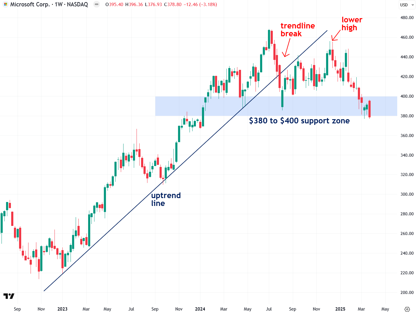
Microsoft, a key bellwether of the Magnificent 7 with its massive $2.82 trillion market capitalization, is showing signs of topping and rolling over on the weekly chart. It broke below a major trendline last summer, followed by a lower high in December—often a signal of a new downtrend.
If Microsoft closes below its current $380 to $400 support zone—which it’s now on the verge of doing—I expect a sharp decline that will weigh heavily on both the Magnificent 7 and the broader market. In my view, Microsoft is a canary in the coal mine, signaling potential trouble ahead.
There are also growing concerns at Microsoft from a fundamental standpoint. This week, news emerged that the company has abandoned data center projects totaling 2GW of capacity across the U.S. and Europe over the past six months—citing an oversupply relative to its current demand forecast. This development has raised fresh doubts about the sustainability of the AI boom, which I’ve previously described as a bubble—an assessment echoed just days ago by Alibaba Group chair Joe Tsai. In my view, if Microsoft breaks down further from here, it will be a major signal that the AI boom is unraveling.
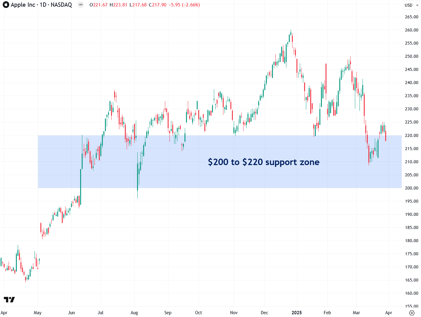
Apple—another bellwether of the Magnificent 7 and the top-weighted stock in both the Nasdaq 100 and S&P 500—has been showing signs of weakness lately. There's a major support zone between $200 and $220, and a decisive close below it would spell serious trouble—not just for Apple, but for the broader stock market as well.
There’s also a troubling development in the communication services sector (ETF symbol: XLC), which heavily overlaps with technology while also encompassing entertainment and media. A bearish head and shoulders pattern has been forming over the past few months, with a key support zone between $94 and $96. If the XLC exchange-traded fund closes below that zone, it would confirm the pattern—issuing a strong bearish signal and posing a serious warning for the broader market.
The Dow Jones Industrial Average (DJIA) has held up better than the other major U.S. indices, thanks in part to its limited exposure to the tech sector. However, its recent double top pattern is a reason for concern. The index is now sitting near a critical support zone between 41,600 and 42,000. A decisive close below that zone would be a significant red flag—suggesting the downturn is no longer isolated to tech, but spreading to other sectors. That would mark a deeper, more widespread market sell-off taking hold.

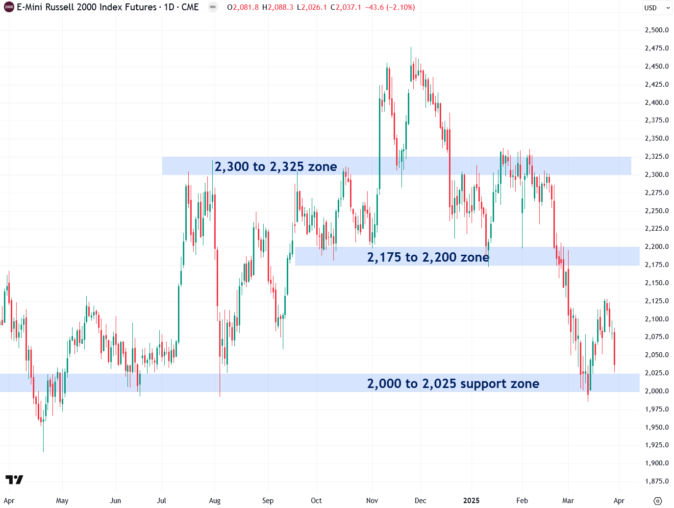
The small-cap Russell 2000 broke below the critical 2,175–2,200 support zone a few weeks ago—a concerning development that triggered a bearish signal. It’s now hovering just above another key support range between 2,000 and 2,025. A close below this level would confirm yet another bearish breakdown, adding further pressure to an already fragile market.
As a more domestically focused index compared to its larger counterparts, the Russell 2000 serves as a key gauge of the so-called “Trump trade,” making this technical weakness particularly significant.
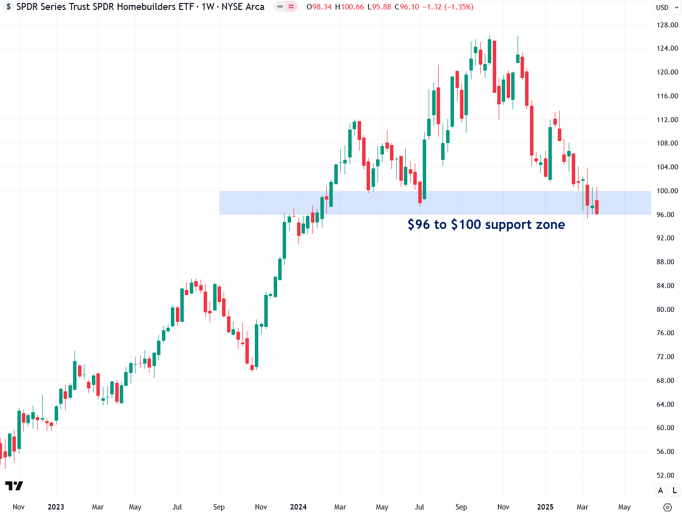
Another key bellwether I’m closely watching is the homebuilding sector, as tracked by the XHB ETF. Housing often leads the broader economy both into and out of recessions, making it a crucial indicator. I’m particularly concerned that the next recession will be driven not only by a tech bust but also by housing when Housing Bubble 2.0 bursts.
U.S. housing has become extraordinarily unaffordable and unsustainable—clear evidence of a bubble. The median-priced home now sits at $433,100, requiring an annual income of $166,600 to afford, while the median household income is just $78,538. (Read my full thoughts on the housing buble and bust scenario here.)
The XHB homebuilders ETF is currently sitting above a key support zone between $96 and $100. In my view, a decisive close below this zone would mark the official start of the housing bust.
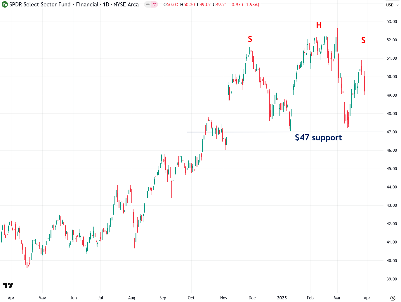
Another sector flashing warning signs is the financials, as measured by the XLF ETF, which is currently forming a bearish head and shoulders pattern. A decisive close below the $47 level would confirm the breakdown and signal that the bust is underway. Given the financial sector’s deep ties to both the stock market and housing, it’s no surprise it would come under pressure as those areas weaken.
The CBOE Volatility Index (VIX)—often referred to as the market’s “fear gauge”—is a key indicator to watch for signs of broader market stress, and moves inversely with stocks. A decisive close above the 27.50 to 30 resistance zone would signal a surge in fear—and with it, another leg down in the stock market.

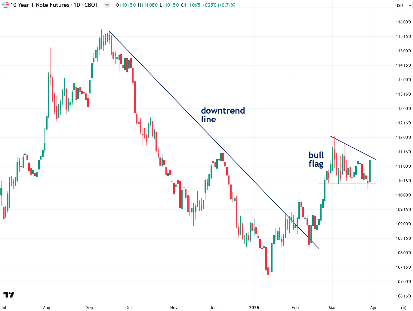
The U.S. 10-year Treasury note—often seen as another fear gauge, since it tends to rise when stocks fall—appears to be forming a bull flag pattern in recent weeks. A breakout from this formation would likely signal continued strength in Treasuries and further downside pressure on equities. I’ll be watching this pattern closely.
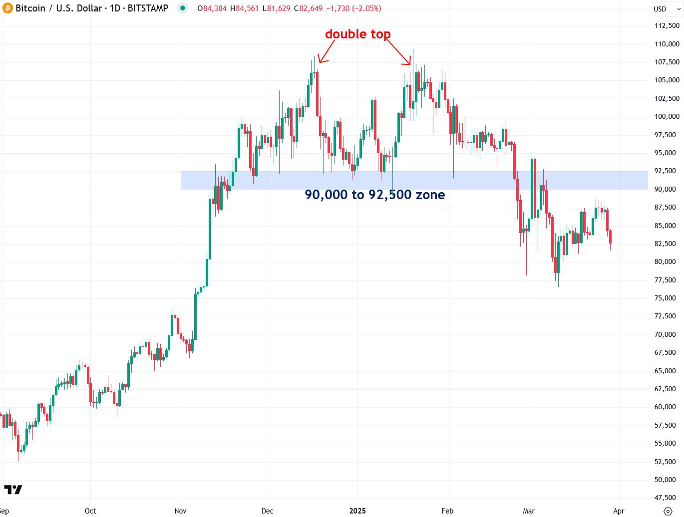
Bitcoin is a key barometer of risk appetite and remains highly correlated with the tech-heavy Nasdaq 100, as I’ve recently explained. It formed a double top pattern between December and February before breaking down in late February and early March. Despite rebounding slightly over the past month, Bitcoin remains below the critical 90,000–92,500 resistance zone—keeping the bearish breakdown intact. Assuming stocks continue their decline, there’s a high probability that Bitcoin will follow with another wave of selling.
XRP, one of the most heavily watched and widely held cryptocurrencies, appears to be forming a bearish head and shoulders pattern. However, this pattern still needs confirmation with a decisive close below the critical $2–$2.20 support zone. Assuming this breakdown occurs, it should trigger a sharp sell-off in XRP, further rattling the broader crypto market and dampening overall risk appetite even more.

It may seem that I’m fixated on downside risk and quite bearish on stocks—and that’s true—but there’s a clear rationale behind it. I firmly believe the U.S. stock market is in the midst of a massive bubble, one that I expect will end badly, as I outlined in a recent report. Multiple valuation metrics confirm the market has far outpaced fundamentals, and even a minor misstep—such as a resurgence in inflation or the onset of a recession—could be enough to trigger a violent unwinding.
One of the key valuation metrics is the S&P 500’s Cyclically Adjusted Price-to-Earnings (CAPE) ratio, which currently shows that the U.S. stock market is more overvalued than it was in 1929—just before the historic crash that triggered the Great Depression:

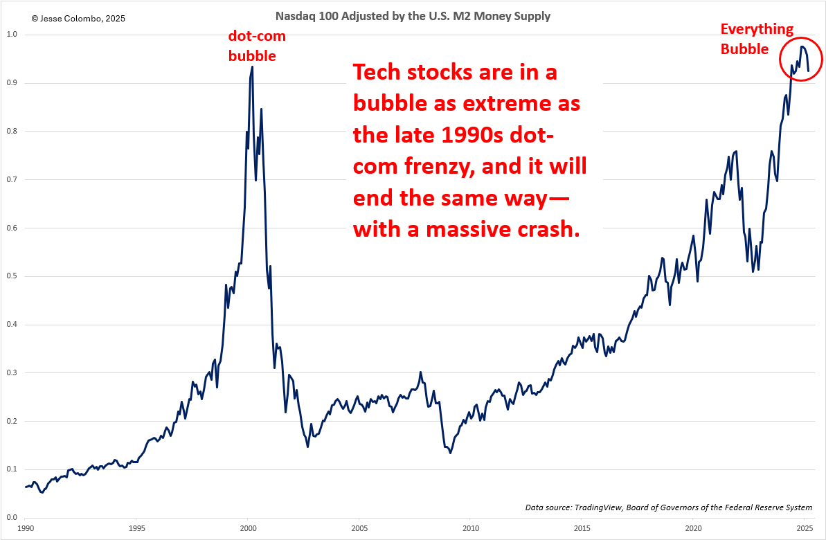
Another stock market valuation metric sounding the alarm is the Nasdaq 100 adjusted by the U.S. M2 money supply, which represents the total amount of dollars in circulation. This metric reveals that the Nasdaq 100—and tech stocks as a whole—are now even more overvalued than they were during the late-1990s dot-com bubble, which ended in a spectacular crash.
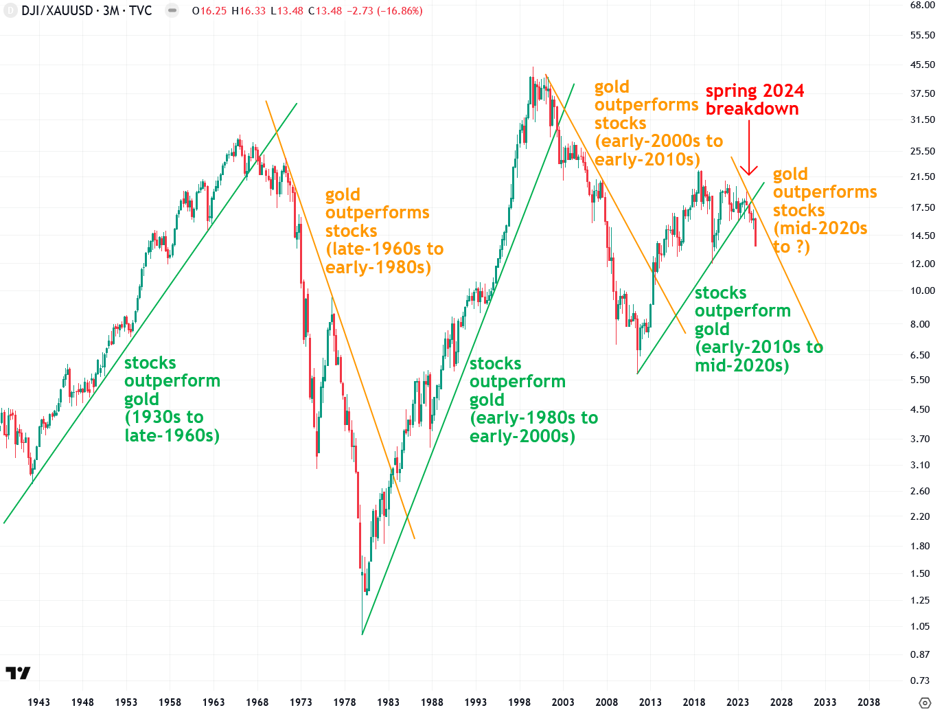
Given my belief that the most popular assets—mainstream stocks, housing, and crypto—are caught in massive bubbles, I’ve chosen not to invest in any of them. Instead, I strongly prefer gold, silver, mining stocks, and other hard assets and natural resources. I believe these tangible investments will be major beneficiaries when those mega-bubbles burst, as society shifts away from the virtual and digital and rediscovers its appetite for the real and tangible—like commodities.
This process—known as a capital rotation—is already underway, as evidenced by the breakdown in the Dow-to-gold ratio that occurred a year ago. That breakdown signaled the start of a major shift, with capital beginning to flow out of stocks and into gold and silver. Importantly, this trend is still in its early stages; historically, these rotations tend to last at least 15 years. I believe the bursting of today’s massive asset bubbles will only accelerate this shift, ultimately driving gold to $15,000+ per ounce and silver into the several-hundred-dollar range—and that’s in real, not nominal, terms.
In summary, I’m seeing increasingly concerning signs of technical breakdowns across the stock market, and Friday’s selloff only intensified the situation. I’ve outlined several key support levels across major indices, stocks, and ETFs—and if those levels break, as appears likely, the selloff will accelerate beyond what we’ve seen in recent months. There will come a time when I’ll be interested in mainstream stocks again—but only after the excessive froth has been cleared out and sentiment has turned decidedly negative. Until then, I remain firmly positioned in gold, silver, and mining stocks—assets I’ve been advocating for all along, and which have, not coincidentally, been the best performers lately. I expect that trend to continue for the foreseeable future.
Kind regards,
Jesse Colombo
Precious metals analyst and investor. Advocate for free markets and sound money. Recognized by the London Times for predicting the 2008 Global Financial Crisis.
Disclaimer: the information provided in The Bubble Bubble Report and related content is for informational and educational purposes only and should not be construed as investment, financial, or trading advice. Nothing in this publication constitutes a recommendation, solicitation, or offer to buy or sell any securities, commodities, or financial instruments.
All investments carry risk, and past performance is not indicative of future results. Readers should conduct their own research and consult with a qualified financial advisor before making any investment decisions. The author and publisher disclaim any liability for financial losses or damages incurred as a result of reliance on the information provided.
Another solid one, Jesse. Thank you.
I'm curious if margin debt is high within the market. I'm assuming it is because excessive risk taking bas been rewarded for 15 years, so it's been a positive feedback loop. An unwinding of margin debt could really accelerate and turbocharge a decline if the PPT remains on the sidelines.